→ I am a graphic designer, a type designer and
a teacher of both disciplines. After more than 20 years in the Netherlands, in Switzerland, the
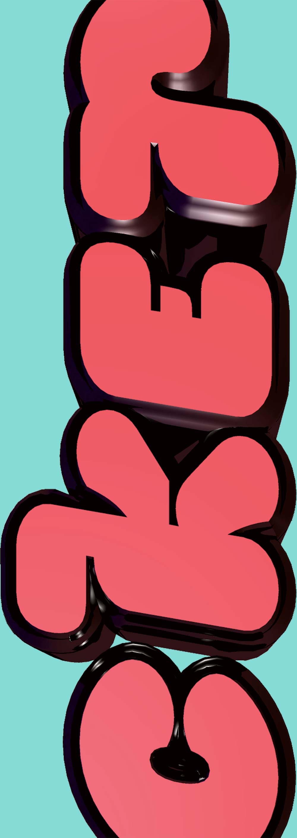
USA and in Germany I now live in New York City again. I drew the typeface you are reading right now and called it
Interpol Serif. I also hand-coded this website in BBedit, old school
HTML5,
CSS3 on the back of ExpressionEngine. Thanks for visiting my site and if you have any questions please don’t hesitate to
get in touch with me…
.
March 2024
permalink: http://famira.com#professorship
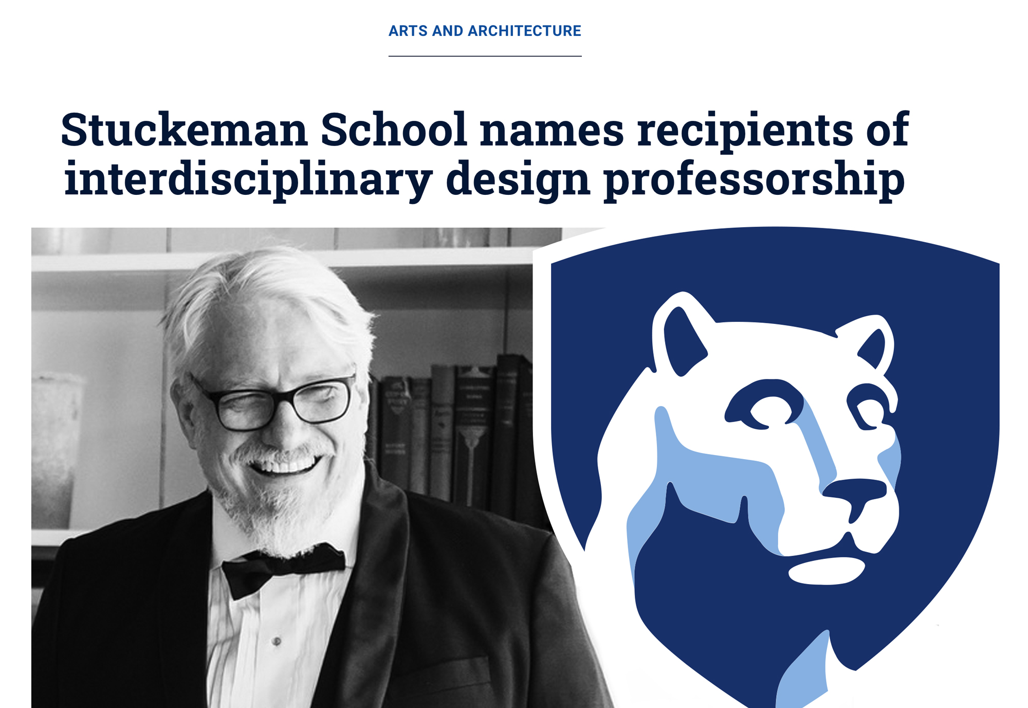
I am honored to have been awarded the prestigious Stuckeman Professorship in Interdisciplinary Design from Penn State University 2024. I am very much looking forward to working with Professor Emily Burns and holding a lecture that will be open to all students and faculty of Penn State University on October 16.
Read more…
December 2023
permalink: http://famira.com#monocle
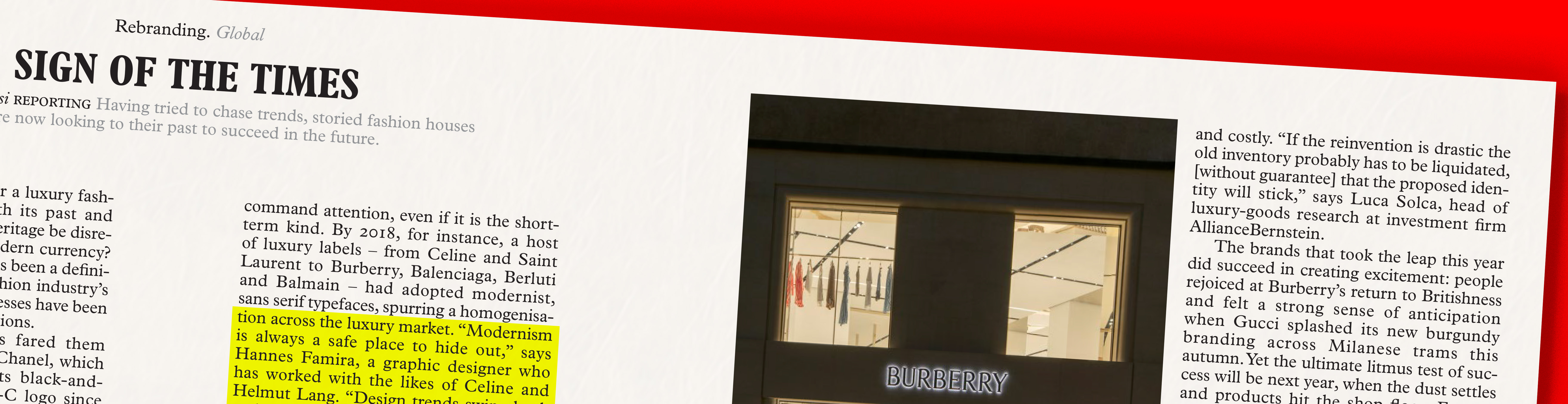
Natalie Theodoso writes for Monocle Magazine. She is making an excellent point about a recent trend in branding and wordmark design in the fashion industry. I am proud that she is quoting me as an authority in her article Sign of the Times of the current November issue.
Read more…
August 2016
start: October 03, 2016
where: The Cooper Union in New York City
permalink: http://famira.com#coopertype_extended_1617
Good news, this October I will start teaching type design in the Type@Cooper Extended Program. I am honored to be taking over from Stephane Elbaz, Christian Schwartz and Berton Hasebe. Here is what I am planing to do in the year ahead.
In the fall term we will explore the different forces that shape the design space in typeface design. Then we will create a revival project based on a text typeface of the participants’ choice. The one limitation of course will be that the original must have been released before 1940, which places it in the public domain. In the spring term we will take what we learned and use it as a starting point for an original typeface project with the one caveat that it has to be be made to work in text size and distinguish itself from the revival project by featuring the exact opposite kind of contrast. In the final term participants will take their original typeface projects and turn it into a family.
So long story short, I am really looking forward to meeting the 2016/17 class of America's next freggin' delta force of type design. Stay tuned and I will report back once we get started.
Read more…
March 2016
permalink: http://famira.com#mailing_list
Let me keep you up to date about classes and workshops that I teach and sign up for my mailing list. I will send one out about once or twice a semester.
.
Work & play
I read something that Milton Glaser allegedly said about his clients also being his friends and I found it to be very true for myself. Most of my clients are indeed friends (or quickly become so). If that shift in the relationship does not happen, it usually signals their limited life expectancy as clients. I love being a collaborator and, as a designer, delivering unique work is very close to opening up as a person. The outcome has proven that my work benefits hugely from the comfortable milieu of trust and friendship.
I studied graphic and typographic design at the
KABK (Royal Academy of Fine Arts in The Hague) in the Netherlands. After apprenticeships at Studio Dumbar and the Font Bureau I worked at Meta Design, the Buro Petr van Blokland and House Industries. I started my own design studio Das Kombinat in 1999 and the Kombinat-Typefounders in 2001. Now I am in the process of re-inventing the type foundry part under the new name famiraFonts
To see what I am working on right at this minute you can also check out my
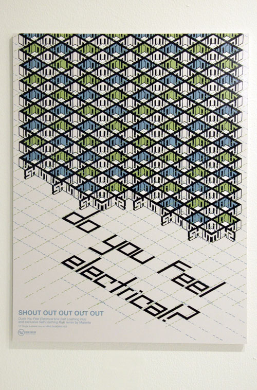
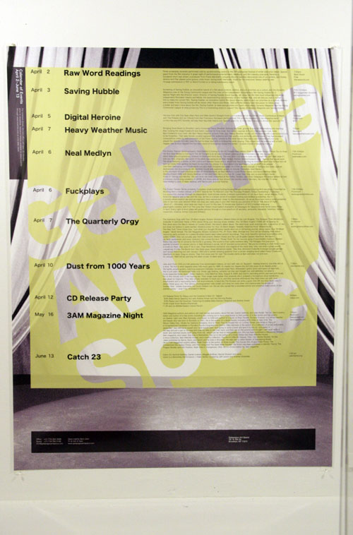
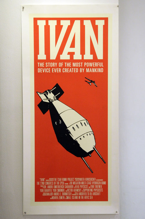
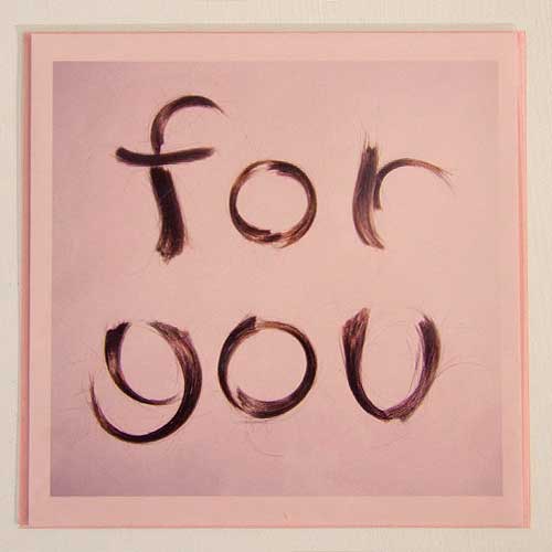
Dribbble account. Also it is unfortunate that some of the nicest jobs I have worked on are still protected by non disclosure agreements so I can’t show them. Here are a few pieces however that I can talk about.
For more of my work history please check my
bio section…
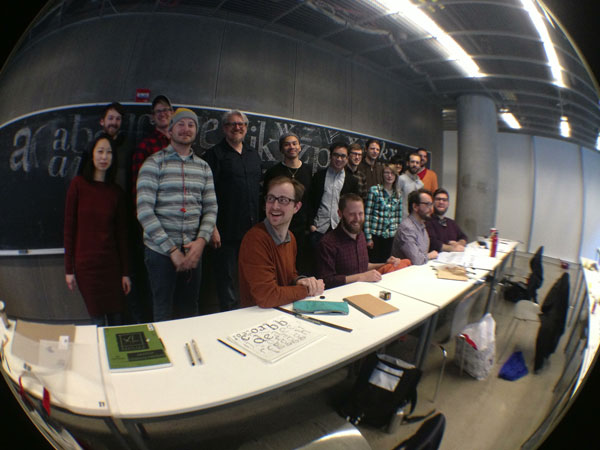
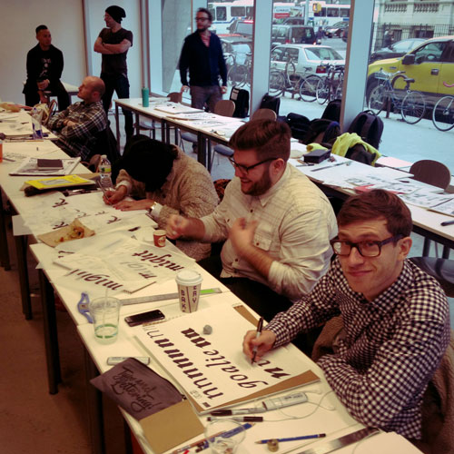
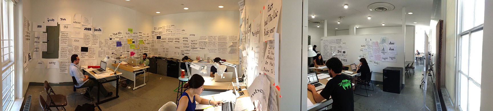
Type@Cooper work space panorama 2013
scroll to pan
→
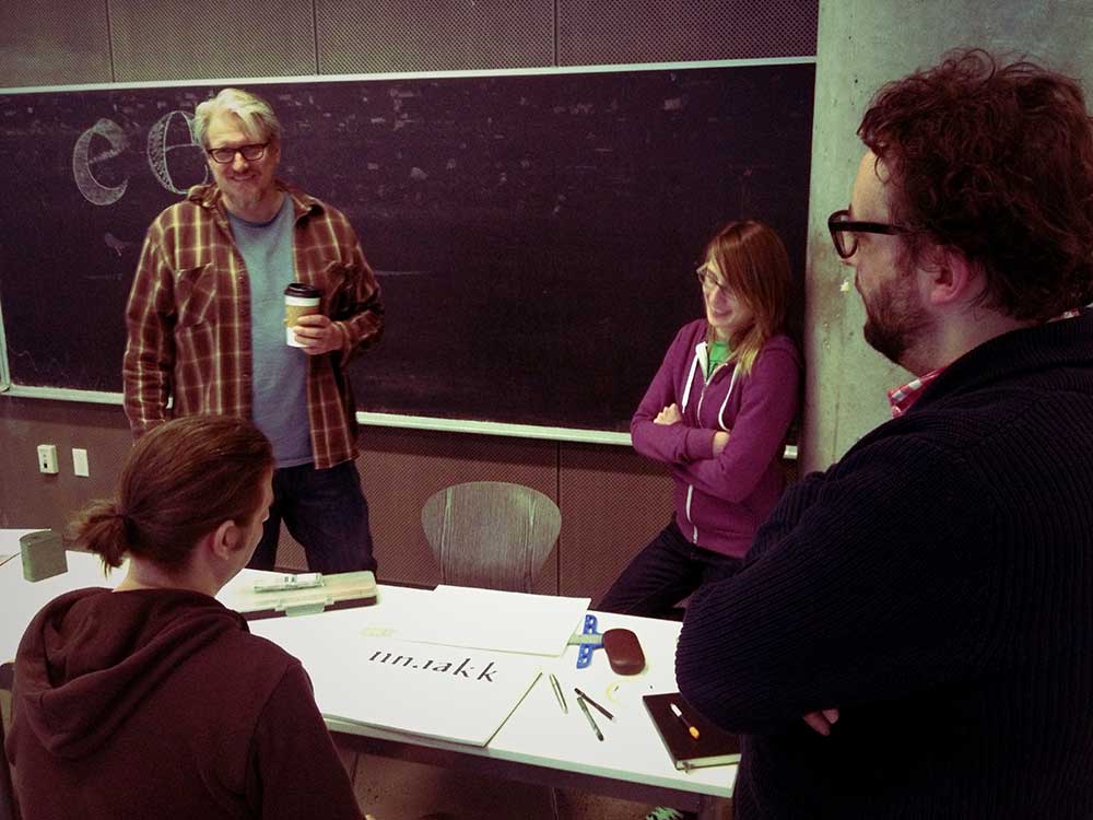
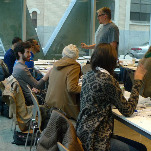
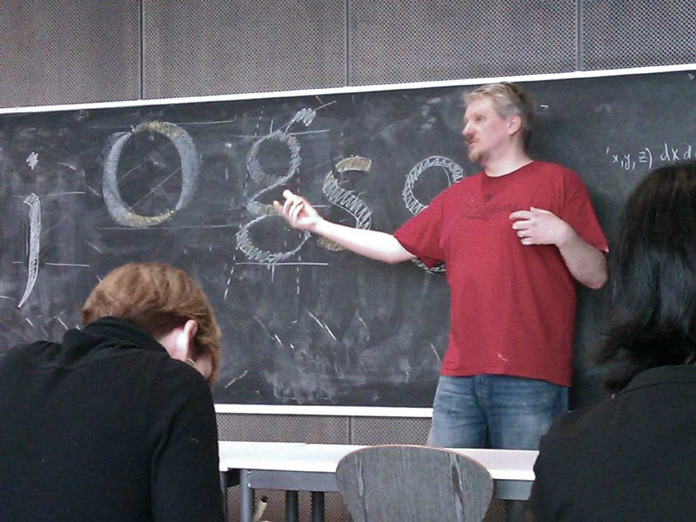
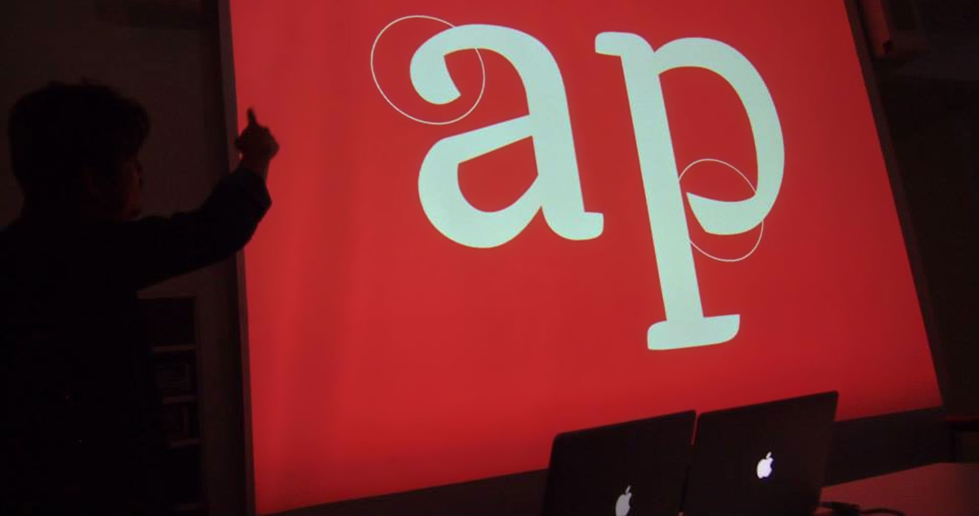
Blackboard
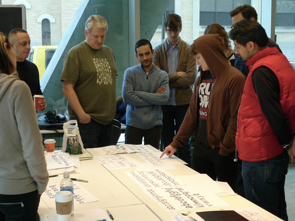
Discussing the intricacies of the roman lower case g
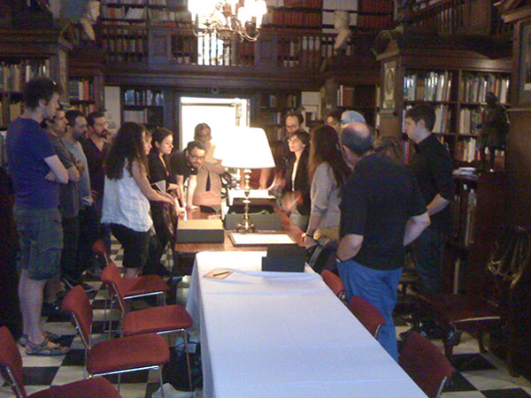
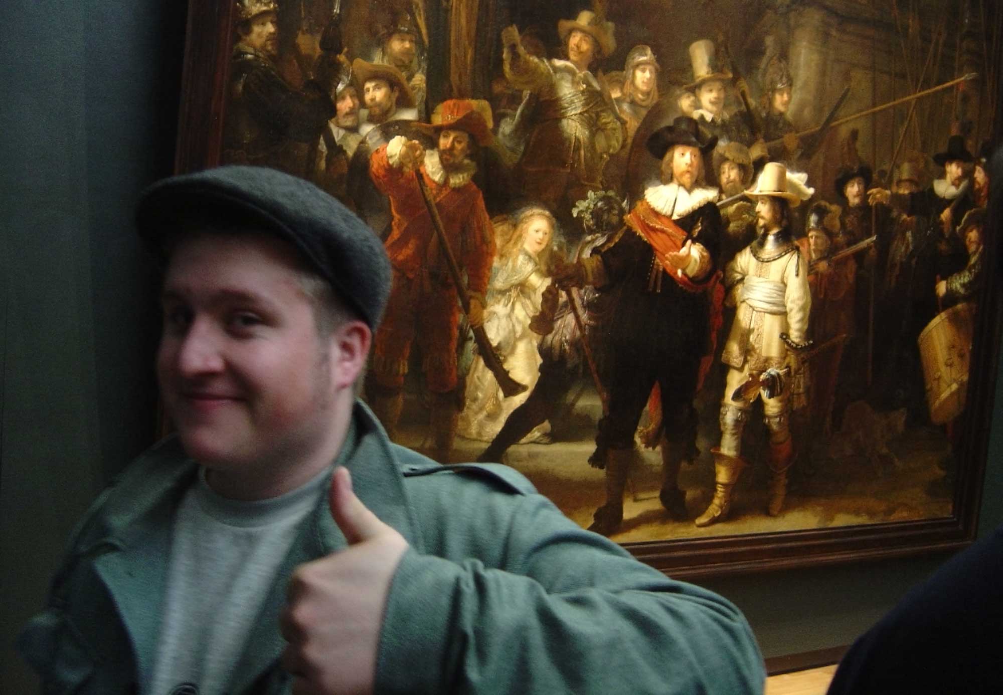
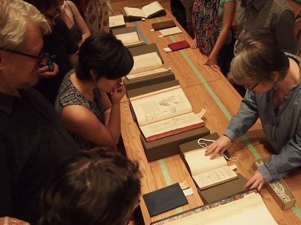
The Grolier Club
A visit to one of New York City's finest rare books collections
Final presentation
On the last day of the Type@Cooper Condensed program students present their projects. I believe this is Christian V. at the bat.
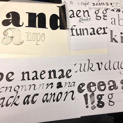
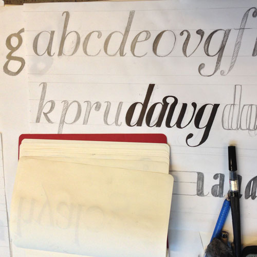
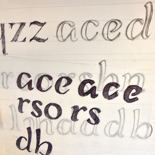
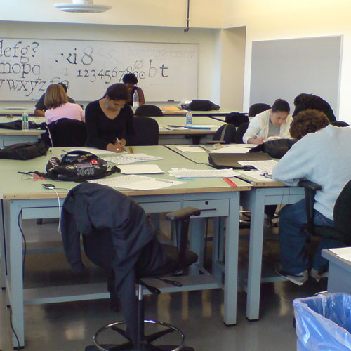
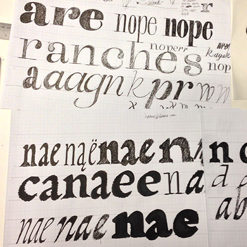
Student sketches
Design Space workshop, 2014
Field trip to Amsterdam
In 2004 I took my Basel class of Typographic Designers on a week in The Netherlands. We visited museums, local design studios, saw the old masters and ate heaps of bitterballen.
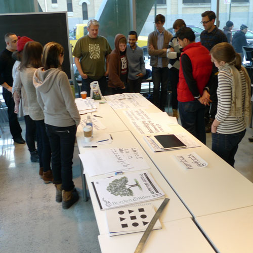
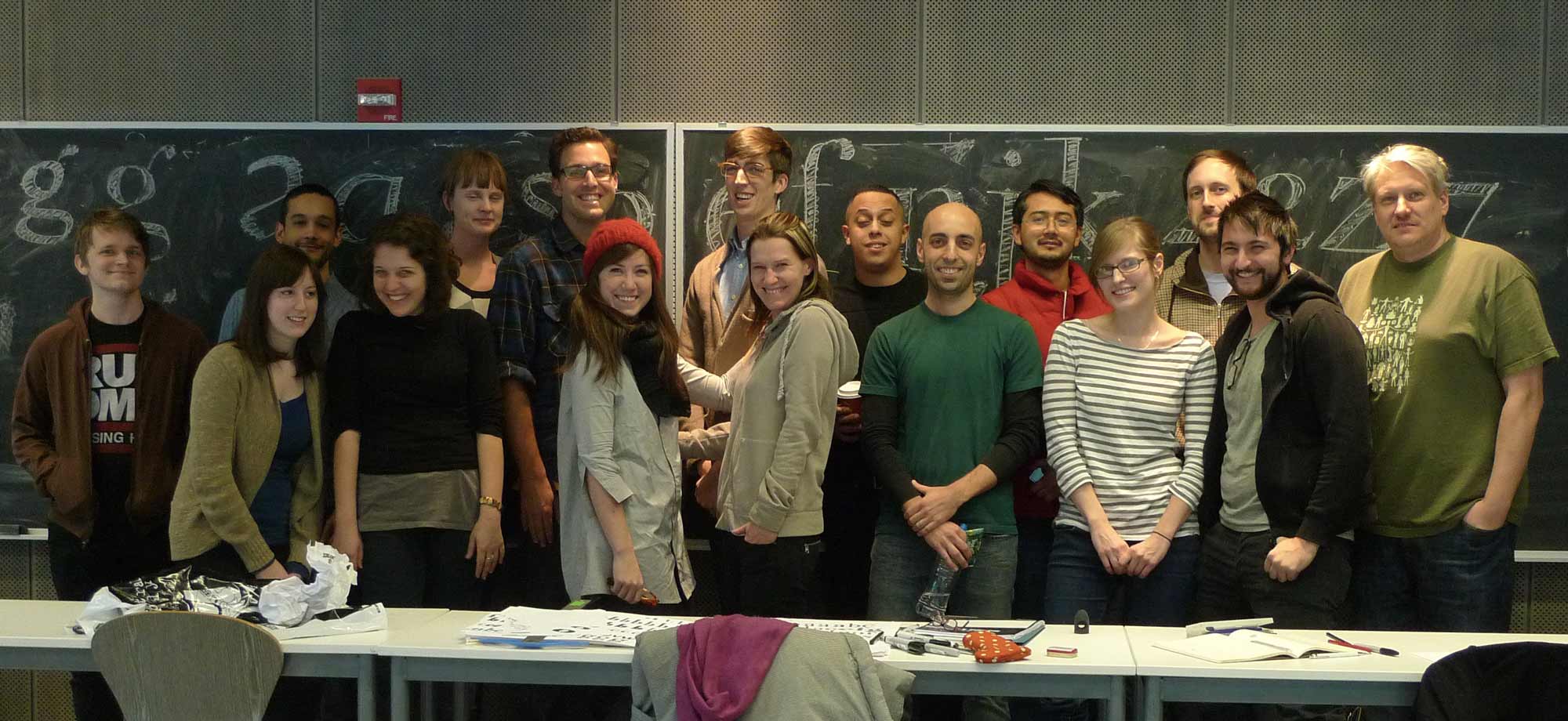
Workshop participants
Workshop: Understanding and Experiencing the Designspace. Every year Jesse Ragan’s Extended students manage to surprise with their level of skill and comprehension.
Group critique
The Butler Library
As part of the Type@Cooper Condensed Program we take the students to visit a number of rare books departments. Here we are at Columbia University.
Poster project
Undergraduate, Typography II
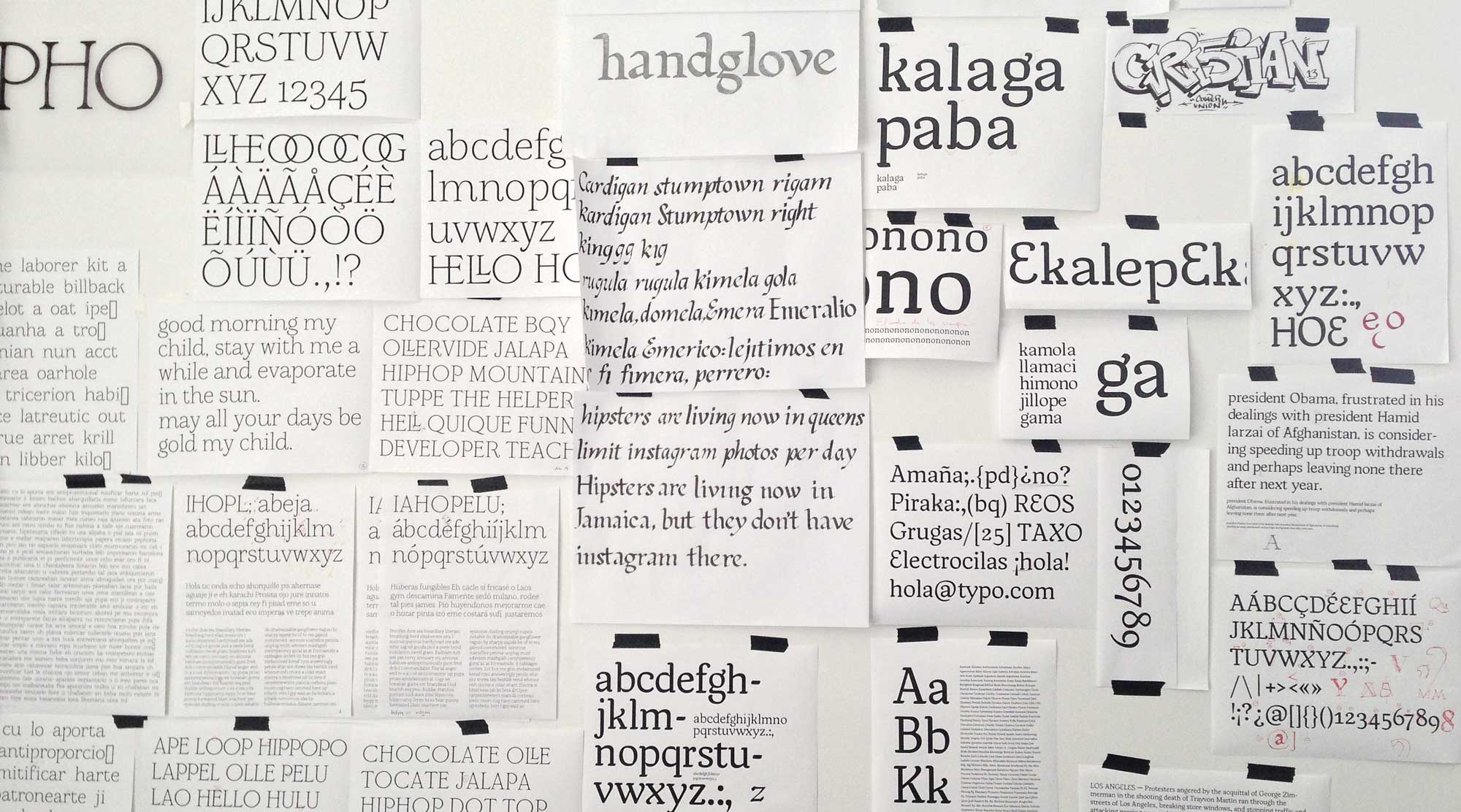
Group critique wall
Type@Cooper Condensed Program, summer 2013. A review of the first step towards the student's own, original, digital typeface.
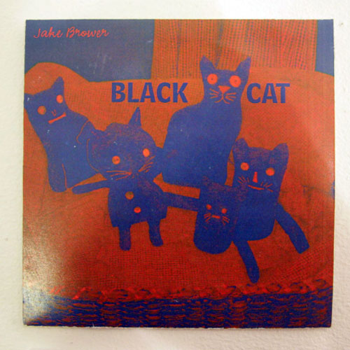
45 vinyl sleeve
Undergrad, Typography II
Original typeface project
Undergrad, Experimental Typography
All student work is copyright © by the students who created it or in some cases by the respective schools they were enrolled in.
I have taught individual, private type design classes for beginning and advanced students. I coached students in building their portfolio and served on the committee for student admission.
In Switzerland I was a member of my school's working group that wrote a detailed standard—course description, syllabus and lesson plan—for the creation of the new undergrad Graphic Designer program. I also served as a specialist for new media to the board of the centralized Swiss federal exams and as an examiner for type design and new media on the board for the state exams.
Schools and universities
- Type@Cooper in the Extended and Condensed programs
- Rutgers, The State University of New Jersey, Mason Gross School of the Arts
- The University of the Arts, Philadelphia
- UdK, Universität der Künste, Berlin
- CUNY, City University of New York
- Kunsthochschule Kassel
- HAWK, Hochschule für angewandte Wissenschaft und Kunst Hildesheim/Holzminden/Göttingen
- NJCU, New Jersey City University
- The Cooper Union for the Advancement of Science and Art, School of Art, NYC
- SfG, Basel School of Design, Switzerland
Names of classes I have taught
- Typografie und digitale Medien (Typography and Digital Media)
- Computergrundlagen (Introduction to the Computer)
- Neue Medien (New Media)
- Entwerfen I (Design I) co-teaching with Peter Olpe
- Zeichen, Schrift (the mark, the type)
- Schriftgestaltung (Type Design)
- Typography I
- Typography II
- Experimental Type
- Type Design
- Advanced Design - Type Design
- Principles of Typeface Design 1: From Pen to Pixel
- Principles of Typeface Design 2: Beyond the Basics
- Typedesign and Lettering
- Introduction to type design: Hand drawn type - The Roman Letterforms
- Introduction to type design: Hand drawn type - The Italic Letterforms
- Introduction to Digital Type Design in FontLab Studio v.5
- Type@Cooper Condensed Program
- Type@Cooper Extended Program
Workshops I have taught
- Type Design Basics – 5 days
- Understanding and Experiencing the Designspace – 2 days
- Introduction to Robofont – 1 day
- Type Design – 1 day
- Type on Screen – 4 days
- Grundlagen der Schriftentwicklung (Basics of Typeface Development) – 2 days
- Von der figürlichen Skizze zur Bildergeschichte (From a Figurative Sketch to a Story in Pictures) – 5 days

Slanted Magazine
The Art Type issue presents international artists who use and examine type and language in their work. My interview was conducted by Wolfgang Wick of Buero
MAGENTA. You can
read the interview here…
«Type should be fun»
MAGMA Brand Design, Dec. 2013,
vol. 22,

Type Navigator
This Independent Foundries Handbook introduces 20 small, and very small type foundries, among them my outfit, the
Kombinat-Typefounders.
Jan Middendorp and TwoPoints.Net
Die Gestalten, 2011,
320 pp, in English language

Made with FontFont
“Made with FontFont” is a companion to “FiFFteen”, an exhibition celebrating FontFont and
FUSE. Edited by Erik Spiekermann and Jan Middendorp, it showcases the history and influence of the award-winning foundry with real-world examples of FontFonts in use. Featured here is my typeface the ffBlocker.
Jan Middendorp and Erik Spiekermann
Mark Batty Publisher, 2007,
352 pp, in English language
")
e (FontShop magazine #11)
This special edition of the FontShop magazine was published to the occasion of Erik Spiekerman being awarded the third Gerrid Noorzij price on February 18, 2006. The book contains contribution and dedications by numerous Dutch designers and friends showcasing a brief history of Erik's work and his influence on the contemporary type design scene. Presented here is my typeface ffBlocker.
Jan Willem Stas and students of the Type]Media program at the KABK
FontShop Benelux, 2006,
vol. 11,
96 pp, in English language

Ha daar gaat er een van mij
The title translates to “Hey, there goes one of mine!” —
This is a book about design in the Hague/Netherlands from 1945-2000. Presented here is my typeface ffBlocker.
Author Jan Middendorp, design Huug Schipper
010 Publishers, 2002,
304 pp, in Dutch language

Zwiebelfisch
My interview was conducted via email by Emanuela Fechete.
Created by the students of Freie Hochschule für Grafik Design und Bildende Kunst in Freiburg, Germany.
Read the interview here…
Jos Fritz Verlag Freiburg , 2003,
80 pp, in English language

Schriften österreichischer Designer
The title translates to “Typefaces of Austrian Designers” —
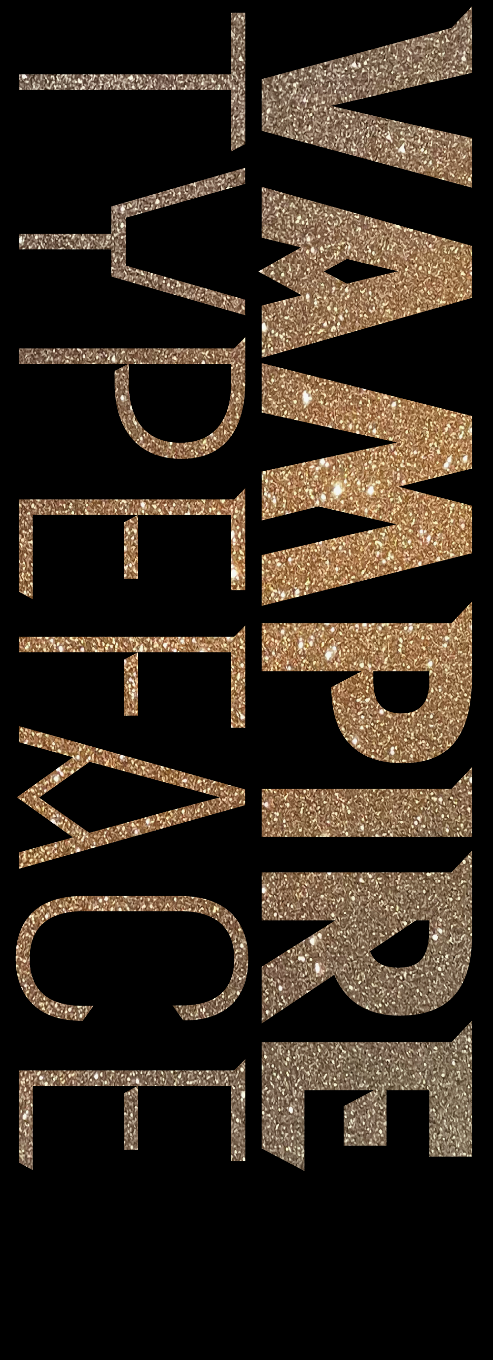
An irregularly published, loose leaf newsletter, showcasing Austrian type designers. This issue was dedicated to my super family of typefaces, called
Interpol.
Design Austria (the Society of Austrian Graphic Designers), 1998,
vol. 5,
6 pp, in German language

Haagse Letters
The title translates to “Letters from The Hague” —
"InterPol" and "InterSerif", early versions of the typeface family Interpol Serif and Interpol Sans were published in the book Haagse Letters.
Author Mathieu Lommen, design Peter Verheul
Buitenkant, 1996,
72 pp, in Dutch language

KABK Eindexamenboek
The title translates to “
KABK Degree Show Book” —
Every year the Royal Academy of Fine Arts produces a book featuring student work, one graduate per page. Typefaces presented here are Interpol Serif and Interpol Sans.
Studio Matzwart, Paulina Matusiak and Carrie Zwarts
KABK, 1996,
, in Dutch language

con form
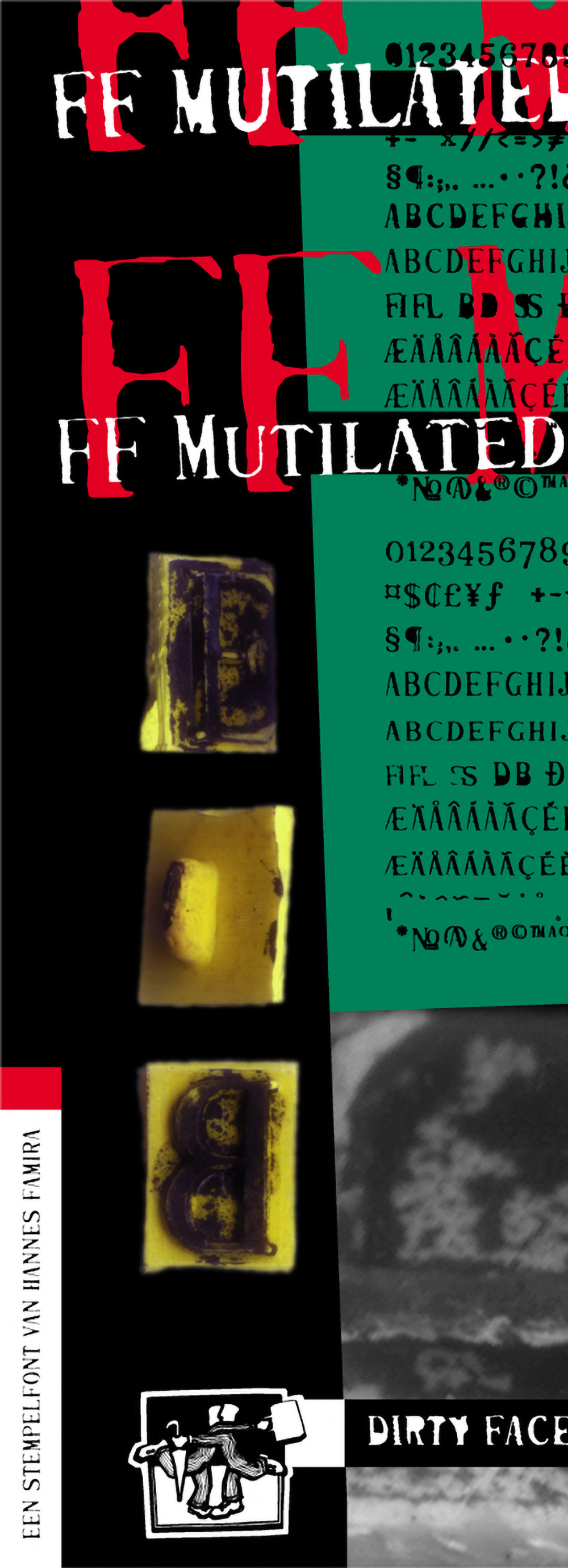
In 1996 the KABK, Royal Academy of Fine Arts hosted the annual ATypI conference in Den Haag. To that occasion it published this book, showcasing the state of type design education at the Royal Academy. Typefaces presented here are ffMutilated, Interpol Serif and Interpol Sans.
David van der Wij, Jesse Skolnik, Bas Smidt and Paul van der Laan
KABK, 1996,
32 pp, in English language

Sluitzegels voor Tuberculose Bestrijding
The title translates to “Sealing Stamps for Fighting Tuberculosis” —
Catalog of the second design contest held by the Royal Academy of Fine Arts in cooperation the Royal Dutch Tuberculosis Foundation for the design of the annual sealing stamp. Winning designs by Maaike Janssen and Hannes Famira.
Studio Matzwart, Paulina Matusiak
KABK and KNCV, 1994,
48 pp, in Dutch language
12-2023
◈
Natalie Theodoso writes for Monocle Magazine. She is making an excellent point about a recent trend in branding and wordmark design in the fashion industry. I am proud that she is quoting me as an authority in her article Sign of the Times of the Forecast issue- a special edition ahead of the new year. Please read the entire article below.
01-2021
◈
On a grey afternoon in May 2017
Victor Gaultney visited me in my Brooklyn apartment. He was conducting research for his
PhD thesis at the University of Reading. So we had some coffee and talked type. Then just recently, on January 21, 2021 he published his thesis (congratulations!) and now, with his gracious permission I am posting below the raw transcript of his interview with me. As a special treat the questions are set in a brand new italic that I am currently drawing for my typeface Interpol Sans.
09-2015
◈
In the late summer of 2015 Thomas Jockin, the designer of the typeface
Azote and the initiator of
TypeThursday in New York visited me to conduct the following interview. It was first published on
Medium and is here re-posted with gracious permission.
09-2015
◈
The
(Web)fontday is a conference for designers of digital media as well as for front-end and mobile developers. Here is the talk of psychophysicist
Denis Pelli, Professor of Psychology and Neural Science at
NYU. In his talk «How We Read Letters» he explains in plain language his amazing legibility research and mentions some of the work we collaborated on.
03-2015
◈
What are serifs good for, why do some typefaces need them and others don't? This question addresses one of the fundamentals of type design, the function of the serif in the context of contrast. Understanding this issue is much easier when explaining it from the vantage point of calligraphy but for all of us non-calligraphers, here is an explanation that tackles it from a purely empirical perspective.
11-2014
◈
The proof document is a multi-page piece of typography, created to visually explain a font in every detail to the type designer themselves. Its nature is educational and it communicates the most critical kind of affection that a designer can have for their own work. It aims to reveal a typeface’s weaknesses.
05-2014
◈
When getting started working with the type design application Robofont I recommend to check out the links and downloads that I compiled below. This is a list that I prepared for my students but I think anyone new to Robofont might find some of these basic pointers useful. Please don't hesitate to suggest changes or additions. And now have fun…
03-2014
◈
There is a perceived order of things where the large determines the smaller. It is more a gut feeling than a law of physics but it seems logical that bigger objects determine the fait of smaller objects. It is my opinion that in typography the laws of nature are actually turned on their heads. Let me convince you.
08-2013
◈
Wolfgang Wick of Buero
MAGENTA conducted this interview for Slanted magazine by email in the summer of 2013. This issue runs under the title Art Type and presents international artists who examine type and language in their work. Featured are also a number of essays and interviews that focus on the intersection of art, design and typography.
02-2003
◈
This interview was conducted via email by Emanuela Fechte for Zwiebelfisch, a German design magazine created by the students of the Freie Hochschule für Grafik Design und Bildende Kunst in Freiburg, Germany.
05-2000
◈
In 2000 Anthony Calahan visited The Netherlands in order to conduct research for his
PHD and to talk to local type designers. While this interview with Paul van der Laan and myself is clearly very dated and we were just out of art school, I find it interesting how much has changed not least of all the landscape of the type foundries.
09-1997
◈
When the new, unified European currency was first introduced type designers all over the world scrambled to get their hands on workable character design standards and ways to technically implement the euro into the very limiting font technology existing at the time. This is a blog post I wrote in ’97, during that first wave when type designers basically invented the design principles of the euro on the basis of the meager and in part just plain faulty information that was publicly available then.
 ➲
➲
 ➲
➲
 ➲
➲
 ➲
➲
 ➲
➲
 ➲
➲
 ➲
➲
 ➲
➲